Pages

Friday, June 29, 2012

Masculine Layout: Handsome

Happy Friday everyone!
Today is the day I'll share the last  layout I created using The Paper Niche's June Design Kit. This was definitely one of my favorites to make and I really love how it came out. Unlike what you read on my last post, I ams really loving this one! (if you have no idea what I'm talking about, you might have missed my last post. Just scroll down and read the whole story for yourself, and enjoy as I make fun of myself! lol).
Everything on this layout was included in the kit, and I used a white paint pen (Shapie is my favorite!),  after being inspired by someone on the MME blog who brought out the accents on their craft colored paper this way. With my pen, I added a lot of details on both the paper, and the embellishments on this layout. 
I did a ton of layering, and my white pen also came in handy to change the colors of the Thicker letters I used for the title .
The white all over the page just makes everything pop and I love it!
To get more detail on this and all the other layouts I made with the June kit, you can watch the video below. TAKE NOTE: On the video, the first layout's title is unfortunately misspelled....I did not notice it until it was too late (glossy accents had dried! ugh!) and after fixing, it I did not have time to redo the video. However, the video still gives all details you need to know, and gives close ups of everything. I hope you enjoy anyways. The correctly spelled layout is the one I just shared on this post. Thanks for understanding, and  have a great weekend!

Wednesday, June 27, 2012

Three Generations- Embracing imperfection!

It's Wednesday today, and I wanted to share another one of the layouts I created with The Paper Niche's June Design kit. For this one, I tried something totally different from what I'm usually used to doing, and I have to confess, I'm not sure I like it, nor love it, like I do most of the things I create.... As I'm typing here, I'm trying to convince myself it's ok, and it's not too messy hahaha.... I was going for an "old, vintage, distressed" layout....like the kind of page you find in one of your super old albums from back in the day when you had no clue about a "acid free" and "specialty" cardstock....I thought adding the FabScrap distressed paper in the back would definitely evoke that feeling...the picture I used was the reasoning for all this as it looked faded and old...... I did however want to bring out some of the color in the picture, which is the reason of all the red on this layout...and that's where I went all WRONG! lol
As I'm looking at the picture of the layout right now as I type, I think I might have done without the middle red border...it kind of stands out way too much and just adds anther pattern repetition (circles) that competes way too much for my taste with my chicken wire sponged background.......it's just not vintage looking.....I might just rip it off completely....I'm not sure just yet....hahaha the things you realize after you take some pictures, huh? 
I want to post it as is, because like Tim Holtz says, it's good to embrace imperfection sometimes...and also, it's good to share that not everything ends up turning out as perfect as you want it to on your first try.  
I get a lot of emails from people asking for advice, for ideas, and recommendations, and also explaining how frustrated they get when their projects don't turn out the way they hoped for. This post is my way of sharing how it happens to me too sometimes, and is my way of saying: YOU are NOT alone :)
I used several of my Lindy's Stamp Gang products to alter the chipboard flourishes that I included on the layout. I love spraying Starburst Stains and adding shimmery embossing powders to change the look of the chipboard elements I use on my layouts. Love all the texture.
There is tons of distressing, layering, and color, as well as detail I did using my white paint pen on this layout. For the white chicken wire sponged background I used a stencil included in the kit.
I hope you enjoyed today's post...It might not be my favorite layout, but I'm so happy I got to share my experience, and thought process behind it. Just like Tim, I'm embracing my imperfections!
Before the end of the week I'll have another masculine (and totally cool layout I must say---I really LOVE how that one came out, and can't wait to show you!). Until then!

Monday, June 25, 2012

Fun times- a 12 by 12 Layout

Happy Monday!
I'm in the middle of a few things today, but I  to take a moment and share with you this layout I made using the Paper Niche's June kit. Super masculine kit and I had fun creating different projects with it.
I embossed all the chipboard pieces using Lindy's Stamp Gang embossing power and a little bit of black embossing powder. If you follow my blog, you know I love mixing embossing powders when embossing, and I love the finished look.
I did a lot of detail accents with a white pen as you can see in the close ups...
I totally love the bright colors on this layout and how it turned out in the end. I'll share more of my layouts this week, for now I gotta run! See you back soon!

Friday, June 22, 2012

Super Simple Friday: Masculine Cards

Hi there!
I realized I had not added any projects lately to my Super Simple blog series, so today I wanted to share two super simple cards I made last week. They were both used for Father's Day, but could easily be used for other occasions. I used Webster's Pages design paper, and very few embellishments.

As you can see, they are basically the same card, except different colors, different paper, and different embellishments where used in each. This is a good way of producing many cards in a short amount of time. Just choose a simple layout for your card, choose coordinating paper, and cardstock, and do sort off an assembly line to put together your cards. You could get done tons of cards in no time! Thanks for  stopping by the blog today and have a great weekend!

Tuesday, June 19, 2012

A Vintage Truck

Good afternoon everyone! 
Today I'm sharing with you this easel card I made using the Paper Niche's June Design kit. I saw someone use Tim Holtz's Die in one of their cards like this on Pinterest, and I just had to make my own car. For mine I made an easel card, and I love ow it turned out :)
Everything you see in here is from the kit. The car pieces I colored using Lindy's Stamp Gang Starburst Spray in the color Golden Lump go Coal...I also added some "wood patterned" pieces of card stock from the kit to add some "wood grain" the top of the car. I stuck pinks int he back of the truck for some metal "load", and one of the pins I took apart and used the pieces for the handle of the door and the headlight of the car.
The clouds you see here I made from one of the fabric flowers that was in the kit. I just cut the flower in half and glued the petals to the top of the card as clouds. Om to of them I added a wooden banner piece from the kit, which I embellished using some twine from the kit as well.

In the inside of the card, pretty simple, just some pattern paper on dimensional adhesive to help the top of the card stand, more twine and just some black card stock.  In the corner an embossed image from one of my Technique Tuesday's stamps. For a closer look you can watch my video HERE. Have a great week!

Thursday, June 14, 2012

OOPS!

Hi everyone!
Today I wanted to share with you two layouts I created using the May Design Kit available at the Paper Niche. I totally thought I had set these to automatically post on here last month, but checking back on my draft posts today, I saw they never posted, gasp! And of course, from not seeing them posted on the blog, I never uploaded the video I made of these and all their detail either!!! Not to panic, better late than never, here they are! They are completely different from each other, but I used the exact same kit of materials to make them. LOVE the versatility of the Paper Niche Kits!

So sorry for the late posting of these, but I hope you enjoyed them. I'll be putting up what I made with the June Design kit really soon as well. If you'd like to see the close up details, check out my You Tube channel and look for today's video (info to my channel on the top right of the blog). You'll see them in detail there. I'm off to more vacation outings (yes, did I tell you? I'm on vacation this week!). Until next time!

Tuesday, June 12, 2012

Sweet Nothing's Stamp Co. June Challenge

Hi everyone! I am so excited for you to be joining Sweet Nothings Stamp Co. and it’s very talented Design Team for our very first Creative Challenge. 
Starting this month, on the 2nd Tuesday of every month we are going to run a Creative Challenge.  
Some months the challenge may be a color palette to work with, other months it may be a theme or a layout. Every month will be something new and creative for you to challenge yourself with.  Each month there will be a sweet little prize to be won as well.  
For the month of June and our very first Creative Challenge, we will be challenging you to create a project with a color palette.  This super fresh palette is great for summer. 
Here's the inspiration for this month: 
                                                  
Here is what I have created to inspire you to challenge your creative side and play along in this contest:
It's an altered glassine bag filled with cookies. Cookie Sophie was the perfect digi stamp for this project!
Contest Rules:
  • Contest runs from Tuesday June 12th-Tuesday June 26th (12 pm EST)
  • Challenge: To use the color palette above. 
    Colors include:
    cobalt blue, aqua blue, mauvey-dark dusty pink, light peachy pink, and light yellow-ish tan
  • Project must include any Sweet Nothings Stamp Co. digi image.
  • Only one project submission per creative mind please :) 
  • One winner will be chosen by voting by the SNSC DT and announced on SNSC Blog as well as on the Facebook Fan Page
  • Must be a subscriber to the SNSC Blog/Facebook Fan Page
  • Must submit project by Linky Tool by clicking the “Click Here to Enter” below
Prize to be won this month:
Have you been eyeing up a couple SNSC digital images to purchase?!?? Well, this month’s prize is TWO, that’s right… TWO yummy Sweet Nothings Stamp Co. digital stamps of your choice!!!
I do hope you love my project.  Be sure to check out the other amazing Sweet Nothings Stamp Co. Design Team member’s blogs for other great ideas.
Sharon (you are here)

Friday, June 8, 2012

Teacher's Gift & Tutorial

So super excited to share this cool crayon wreath I made for my daughter's teacher. I saw a friend's video  on one she made and had to make one of my own. She got the idea from Pinterest (one of my favorite sites!) and I just tried it right away. So simple!


All the supplies were purchased at Big Lots (crayons) and Michael's (everything else). I made a tutorial video on how I made it, and you can watch it below if you'd like. Have a nice Friday!

Wednesday, June 6, 2012

Faber Castell Design Memory Craft Grand Ambassador

Hello everyone! Today I wanted to share some exciting news!!!
I'm so super happy to share with all of you that I have been invited to join the  Faber-Castell Design Memory Craft Brand Ambassador Team. I have been waiting to announce this for a while now, and I'm so glad I can share my excitement with you today! Over the next two months, eight wonderful designers will share their project ideas using their products. I'll be sharing my projects in the middle of July, so be sure to stop by to check out the projects I create. You don't want to miss them! I can't wait to share them with all of you.
I hope you are all having a great week. I'm just getting ready to start preparing for a little vacation we have planned, so I'm off to do some laundry. Don't you just looove house work?? lol I'm being ironic of course! 
Next up I'll have some layouts  and a cute teacher's gift I made for my daughter's teacher. As soon as I get my pictures uploaded I'll post them up for you to see. Thanks for stopping by the blog today. As always, I appreciate all you comments!

Tuesday, June 5, 2012

There is no doubt...

Hi there! Today I wanted to share a card I made for my anniversary. It's definitely not a manly card at all, but I just had to use the sentiment in one of the 3D stickers from the Follow Your Heart Collection by My Minds Eye. I tried to use a lot of grays to kind of not go off in the pink direction because my husband would have totally hated that lol. It might not be a manly card, but he liked it :)
I did tons of layers and distressing. The "There is no doubt" sentiment is from an Ali Edwards Stamp set by Technique Tuesday.
I used a doily which I sprayed with a Flat Fabio Spray by Lindy's Stamp Gang in the color Sea Shore Sand, and on top of that I sprayed with the Glitz Spritz in the color Scintilating Silver which gave the doily that silver shimmer.
I added some Prima Pearl Swirls, and Prima Lace to finish the front of the card.
On the inside, I matted some of the paper from the collection and added more of the Prima Lace I used in the front.
That's all I have for you today. Hope this card inspired you. I personally loved it. I wish someone had given it to me! lol Until next time!

Monday, June 4, 2012

This and That Hello

Hello everyone and happy Monday! Today I wanted to share a really colorful card I made for a friend. I used another one of my Greeting Farm Stamps for this one, and the This and That collection from Echo Park. Love the bright colors on this one!
I added some white gel pen lines to add extra detail to the different paper mats I added in the background of the card. I think the white makes the mats pop a little from the background. I totally forget to add details like these on my projects sometimes...I have to remind myself to do it more often...
Here's the inside of the card. Really simple like always. I used one of my newest punches on this one too. It's a double punch by EK Success...the flowers in the of the card were the punched pieces left after punching the border you see on the inside. I hate throwing any pieces away lol
Hope you enjoyed today's project. More coming soon!

Friday, June 1, 2012

Rainy Day Sophie

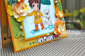
Hello everyone! It has been raining like crazy over my neck of the woods, and well, I'm sick of it lol. The humidity is just awful, and well, you can't get anywhere without getting soaked!  However, among all the yuckiness (like frogs jumping everywhere ewww!), today is the perfect time to share with you Rainy Day Sophie. She's a digital image from Sweet Nothing's Stamp Company, and she's adorable.
I love her little doggie, and had fun coloring the water puddles.  I wanted to make this a cheery and happy card and therefore used really bright colors and lots of pretty flowers which I sprayed with my awesome Blazing Sun Glitz Spritz By Lindy's Stamp Gang. As you might have noticed, I'm spraying it on EVERYTHING!


Like always, very simple of the inside, leaving enough room to write a message inside the card.
Check out the online store for new digital stamp releases every month. There is a growing variety of images for all ocassions. Thanks for stopping by the blog today and have a great weekend!